Although not covered on the Cambridge Spark bootcamp, I wanted to use my knowledge of Power BI to continue investigating the impact of greenhouse gas emissions. With this application my focus switched to CO² emissions movement, identifying electricity production and to shed light on electricity renewables as well as ascertaining the levels of forest loss and the impact that loss had of a countries ability to offset their CO² emissions using the natural forest cover they have.
This section contains the working for the Power BI visualisations together with my comments regarding the composition of these.
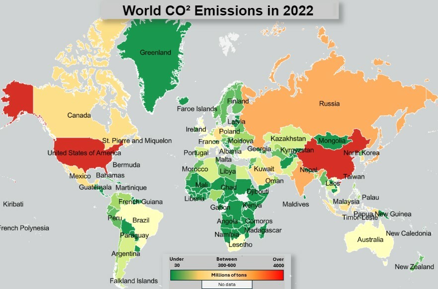
The economic powerhouses are clearly displayed in this map, but the figures for China and United States are over 12 and 4.8 billion tons respectively in 2022 alone. Both these countries CO² emissions dwaft all other countries within my dataset. When you view the movement map which compliments this map, you find that China's CO² figures actually fell by 50 millions tons between 2021 and 2022, however, United States actually increased by 84 million tons within the same period.
Both visualisations and the figures that drive them indicate a worrying trend, that the world is emitting greater amounts of CO², year on year and this is having a real effect on the worlds climate and wellbeing.